Front Cover Ideas

front cover idea 3front cover idea 2front cover idea 1With all three of these front covers I wanted to use the same image and the same text style so that the only aspect changing would be the position of  both the image and the text, all of which were inspired by the layout of ‘The Gentlewoman’. Sticking to this image and text helped to link to ‘The Gentlewoman’ magazine well as a lot of their images are in black and white and they heavily focus on coloured text to make it stand out against the black and white image.

With the first front cover idea I wanted to use a white border around the image as well as have the text separate rather than overlapping. I like this technique as it looks very minimalistic yet there is still a high focus on the image. Also, it is not too overpowering as a first image, but I feel as though for a front cover the image should encompass the page for a more powerful look. Although this layout most links to ‘The Gentlewoman’ as they use a title above and text below the image, leaving empty space around it, which I have similarly done here.

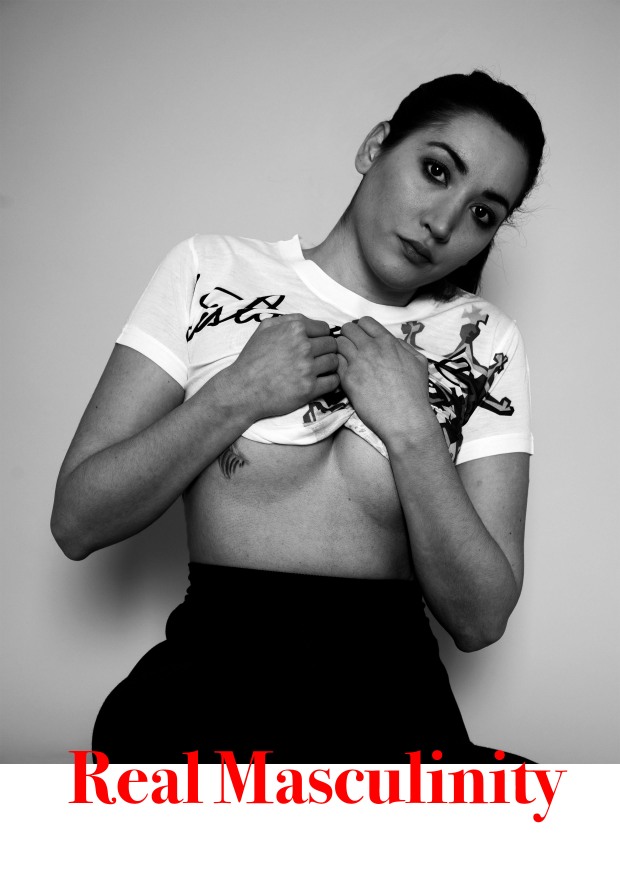
With this second design I wanted to go a lot bigger and use the whole page to apply a very intense feel to the first page. I feel this is also very effective as this is the only image which uses a girl, the reason being is I wanted to show contrast. Therefore, I feel as though this layout is most powerful and effective as it demonstrates that and makes the viewer want to continue. Also, I have seen that ‘The Gentlewoman’ overlaps their vivid writing over some images which I incorporated here. I like the way this looks as it joins the two together. Although I feel as though the writing gets lost in the image slightly.

Finally, this final layout combines the two above images by making the image as big as possible whilst also leaving a slight white area at the bottom for the writing to be inserted, allowing for a break up in the design. I also enjoy the way that the text is slightly overlaid as it helps the page stay joined as one, but allows for more of the image to be seen. Overall, I feel as though this is my favourite layout out of the three for the front cover as it still allows for a bold entrance to the magazine spread, whilst applying some break in between.

Final Shoot Edits

With this shoot we concentrated on experimenting with both colour and the gender of our models. Even though our topic is masculinity, we thought that the use of a girl could help to emphasise this. Therefore, in the first image, we wanted to create quite a sexual image to demonstrate the stereotypical views and representation of women in the media today. This is then contrasted by the other four images of the male models as they are all demonstrating masculine, dominant men.

We experimented with colour as in the last shoot a lot of my images were edited to black and white to accentuate the lighting as well as the tones of the muscles. In two of my images I chose to use a yellow background and a white sofa to create a contrast between the two, rather than making a contrast using black and white. I felt as though this worked well as it set up a strong background to build the picture from. We wanted to use props such as weights and sofas to break the image up rather than just have the model. The weights help to emphasise the fact that men are expected to be masculine and muscly, but on the other hand the use of the sofa creates more of a relaxed look to the images.

We also decided to use two modes within the same image as I wanted to experiment with the different poses that you could achieve by using two models. Overall, I think this shoot went well as it allowed me to improve from my previous shoot and experiment with more things such as lighting and props. This also allows me to have more options when creating my magazine spread.

Studio Shoot 1 Edits

When shooting these images we used a variety of outfits to try and represent what masculinity is. But when editing the images I found that the images that strikes me the most were the ones of the model wearing the suit and the topless ones. This is due to the fact that I found they came across more masculine in a stereotypical way as the muscles were apparent. Although I did include one image of the model in the branded items as I found the colours went really well and contrasted from the rest of my images.

When editing them I wanted to make sure I varied between both black and white and colour as I feel as though black and white would have been good when looking at the suit as in a lot of magazines I have seen this technique used, as it makes the model seem classy. But when making the images black and white I when the model was wearing the suit I wanted to enhance the suit and make it seem darker than it was to be able to increase the contrast of the image and make it seem bold. When using colour I increased the saturation so that they were very rich. The bottom left hand image is one of my favourites due to the contrast in the colours and how they both stand out. By increasing the contrast it also emphasised the lighting that was used, as for example, in the fifth and ninth image when the model is wearing a suit, I increased the contrast so that there was more of a highlight on the face, which I thought was especially effective in the ninth image. Although, I lowered the amount of contrast in the first image as I wanted it to be very smooth.

Overall, I feel as though a variety of techniques were used when editing these images and the difference between each image was emphasised through these techniques.

Studio Shoot 1 Contact Sheet

This slideshow requires JavaScript.

With this studio shoot we used a male model and experimented with different clothing, lighting and poses to create these final images. We used a parabolic light and two main lights to create shadow where needed. To represent masculinity we wanted to portray him in a stereotypical way, which meant we put him in a suit as well as used him topless to be able to show the muscular body that men are expected to have. We used props such as seats and blocks to create different poses and break up the images. We also wanted to use a clothing brand to mirror what fashion magazines do and how they advertise them. Overall, I feel that this shoot shows a lot of diversity and would be interesting to use in the magazine spread.

Clothing Contact Sheet

clothing test shoot-1clothing test shoot-2clothing test shoot-3clothing test shoot-4clothing test shoot-5
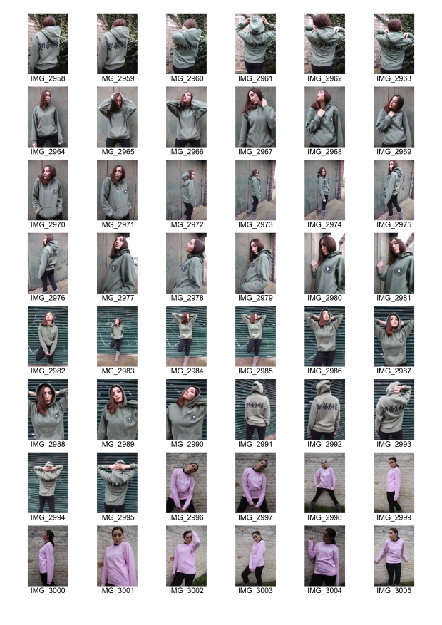
For this test shoot we concentrated on testing out one of the clothing types that we were going to use for our final shoot. We decided to use a female model for this test shoot as this is something we wish to incorporate, as we want to have a mixture of men and women in our final shoot to portray masculinity. A mixture of derelict looking backgrounds were used to help amplify the look of the clothing, that being the colour and style of it. The main idea was to be able to make the female model appear more masculine through the experimentation of lighting and composition. Overall, I feel as though this shoot went well as a starting point to develop our ideas from within a studio space.

Clothing Test Shoot

With these edits I wanted to create strong contrasts between light and dark or the colour palette to make them more harsh. The reason behind this is because I wanted to portray more masculine features and present more of a strong feel to the images. Within these four edits this can be portrayed through contrast, lighting and composition. For example, all of these edits are composed from a lower angle to give the model a look where she is raised and almost above everything else, adding a sense of power. I tried to include colour more to be able to see the colours of the jacket and clothing, which I feel contrast from the background a lot due to the fact it looks derelict. The lighting in the fourth edit I find the best and will consider emphasising this and playing with this in the studio, as it highlights the face and almost gives a film noir feel to it. Also, the lighting in the second image is one that I want to explore further as I have mentioned this in my mood board, I wanted to light half the face and provide a stark shadow which provides a sense of mystery but also presents them to be strong. Overall, I feel as though these edits helped to emphasise the masculine feel that we are trying to portray through the female model.

First Shoot Mindmap

For this first shoot me and my partner will be focusing on the masculinity aspect of our chosen topics by using our model Basit Bakare, styling him using the Christ of Zikel clothing brand. When taking these images I want to make sure I get a good range of both portrait and landscape images so that when I go to make my magazine spread I have many different ways to display them. When taking the images I want to make sure the background is either black or white as the focus is on the person and the clothing rather than the background, and a plain background will help emphasise this.

Using both close up images and full body images will be useful as it can help focus on certain areas of the model, allowing me to accentuate certain features, or a full body image will help to create shape whilst also looking at the clothes. We looked at different types of lighting in a workshop and I found that short lighting and broad lighting would be the best for this shoot, as they contrast very much so they would give me and my partner a wide range of results. I wanted to demonstrate the theme of masculinity through the male body itself; being stereotypical with a model that has a good physique, whilst also using lighting to emphasise this. For example, harsh lighting would be good as it could help demonstrate strength within masculinity.

To support this, the use of using women within this shoot might be useful as well to enhance masculinity by having a delicate woman next to him, or even to counteract this by having a woman dressed in a suit for example. Finally, the use of different clothing could help support the theme of masculinity in this shoot by using items such as builder hats or props.